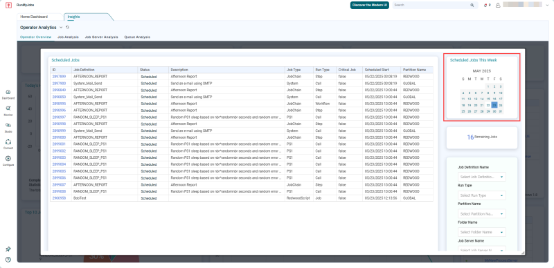
Scheduled Jobs Calendar Heatmap
This widget displays in the UI with the following names:
-
Scheduled Jobs
Calendar heatmaps help Operators to visually identify patterns of behavior, especially with failing Jobs. Together with widgets that display Queue or Job Server volume, Calendar heatmaps can be valuable to quickly identify high failure rates on days where, for example, Queue activity or total Job activity is higher than normal.
A gradient color scale shows how many Jobs are associated with each date within the calendar, with the darkest colors indicating the highest number of associated Jobs. If you click a particular date in a calendar heatmap, other dashboard widgets will update to display data from that date.
Depending on the dashboard, the Scheduled Jobs calendar heatmap may display a single month or a three-month future view of Jobs with the status Scheduled.