Generated Insights
Many of the Redwood Insights dashboard widgets include narrative analyses or generated explanations that further summarize the data being shown. In some cases, the additional context may help you to more easily identify anomalies and understand why they may have occurred.
Narrative Analysis
Narrative analysis can help you understand what a widget is showing. A narrative analysis not only summarizes data, but also breaks it down into additional metrics such as percent contribution, time variance analysis, and volume variance.
Narrative analyses are enabled on most bar, column, and line charts. You can view a narrative analysis by toggling the Show/Hide link at the bottom of the widget.
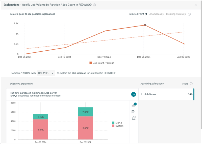
Generated Explanations
Many widget types can support generated explanations. These make deeper analysis easier by pointing out potential anomalies and breaking points. Generated explanations also let you dynamically switch chart types, measurement factors, and other features in order to better understand the data being displayed.
In supported widgets, you can right-click a line, column, or bar chart to get an Explanation menu option. If you select a point on a line, analytics display below the graph. In some cases, you can select different graphical representations of the data.